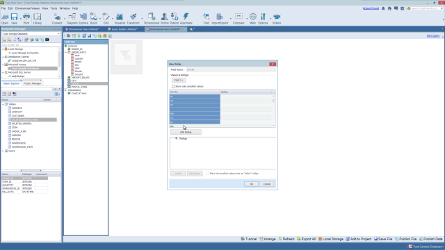
Overview of the dimensional viewer in Toad Data Point
 06:32
06:32
Related videos
Introducing Toad Data Point 6.4 for Smarter, Faster Data Insights
Discover Toad Data Point 6.4, your ultimate tool for smarter data analytics. From integrated GenAI to seamless Databricks connectivity, this release simplifies ...
01:21
Simplify Data Preparation with Toad Data Point
Toad Data Point empowers over 40,000 users worldwide with its all-in-one solution for data preparation and analysis. With support for 50+ data sources and groun...
01:06
Overview of the diagram tool in Toad Data Point
In this video you will learn about the database diagrammer tool in Toad Data Point, the solution from Quest that lets you streamline data access, preparation an...
07:40
How to use the dimensional viewer in Toad Data Point
This video demonstrates how to use the dimensional viewer in Toad Data Point.
04:38
How to backup and restore data in Toad Intelligence Central
This video demonstrates how to backup and restore data in Toad Intelligence Central.
02:32
Enhancements to the Transform and Cleanse window in Toad Data Point - Part 2
See some significant enhancements on how you store, organize and share the transformation rules that you create while using the Transformation and Cleanse windo...
01:28
Enhancements to the Transform and Cleanse window in Toad Data Point - Part 1
See some significant enhancements on how you store, organize and share the transformation rules that you create while using the Transformation and Cleanse windo...
03:04
Using Transformation and Cleanse within Toad Data Point Workbook
Learn how to use Transformation and Cleanse within Toad Data Point Workbook.
09:20
Toad Data Point Professional edition demo
Trying to decide between Toad Data Point editions? Watch this Toad Data Point Professional product demo to explore features and help you decide.
03:57
Toad Data Point Professional with analytics edition demo
Trying to decide between Toad Data Point editions? Watch this Toad Data Point Pro with analytics product demo to review features.
02:11
Toad Data Point Import/Export Wizards
Watch this short demo of how to use the import and export wizards in Toad Data Point
04:17
Toad Data Point Import Wizard
Watch this short demo of how to use the import wizard in Toad Data Point
04:22
Query Builder date ranges and bind variables in Toad Data Point
Learn about using date ranges and bind variables in the Query Builder in Toad Data Point.
08:34
Overview of Toad Intelligence Central
Learn how to make data provisioning more efficient in this overview of Toad Intelligence Central.
09:04
Toad Data Point base edition demo
Watch this Toad Data Point base edition demo for an overview of the features and functionalities the tool offers.
02:13
