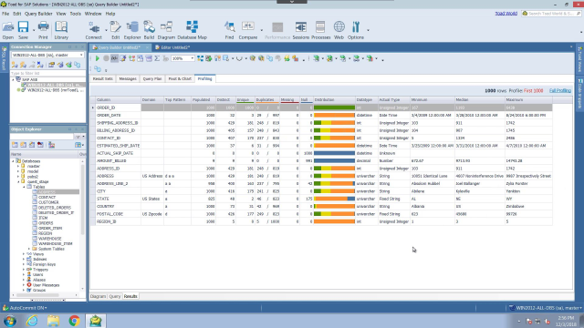
How to better understand your SAP data with Toad for SAP Solutions
 03:48
03:48
Related videos
Introduction to Toad for SAP Solutions
Whatever your SAP platform and whether you're developing or managing SAP databases on premises or in the cloud Toad has you covered with Toad for SAP Solutions ...
01:20
How to work with objects in Toad for SAP Solutions
Learn how to work with objects in Toad for SAP Solutions from Quest.
03:34
How to update your production environment in Toad for SAP Solutions
Learn how to update your production environment in Toad for SAP Solutions from Quest.
03:07
How to organize your content in Toad for SAP Solutions
Learn how to organize your content in Toad for SAP Solutions from Quest.
02:15
How to keep test data updated with Toad for SAP Solutions
Learn how to keep test data updated with Toad for SAP Solutions from Quest.
03:29
How to easily move data with Toad for SAP Solutions
Learn how to easily move data with Toad for SAP Solutions from Quest.
03:38
How to connect to sources in Toad for SAP Solutions
Learn how to connect to sources in Toad for SAP Solutions from Quest.
04:03
How to troubleshoot in Toad for SAP Solutions
Learn how to troubleshoot issues in Toad for SAP Solutions
03:16
How to automate repetitive tasks in Toad for SAP Solutions
Learn how to automate repetitive tasks in Toad for SAP Solutions from Quest.
02:27
Organizing your development environment in Toad for SAP Solutions
Learn how to better organize your development enviornment in Toad for SAP Solutions from Quest.
04:12
How to build queries faster in Toad for SAP Solutions
Learn how to build queries faster in Toad for SAP Solutions from Quest.
03:09
Understanding the user interface in Toad for SAP Solutions
Learn how to use the user interface in Toad for SAP Solutions from Quest.
03:08
How to install Toad for SAP Solutions
Learn how to download and install Toad for SAP Solutions from Quest.
03:06
